Expertise on Data Visualization Delivered Fast
If you want to get a solid handle on your data so that you can begin to answer business questions, develop insights, and make better-informed decisions, our analytics consultants can help and put their diverse industry experience to work for your company. The size of your company and source of your data (e.g. spreadsheets, .csv files, databases, data warehouse, etc.), doesn’t matter, as we have a strong team of data visualization consultants that can quickly help you:
Boost your business intelligence with better data visualization. We help enterprises to develop customized dashboards for any data source or KPI of any size. It helps in augmenting data accessibility and improves decision-making capability.
Feed your dashboard with plenty of data from multiple sources would make it difficult to analyze your required data. Visualize the important KPIs with filter options to get customized reports with our customized dashboard optimization services. We help enterprises to optimize their dashboards based on their business requirements reducing load time and augmenting the output in real-time.
We develop a modern data platform enabling you to access business insights across the departments. Our data platform development team brings innovative methods to design the platform to assist you in finding the right insights quickly.
The most critical step is preparing the data for business intelligence. We collect, clean, and consolidate all raw data from multiple sources and turn them into interactive reports.
Benefits of Data Visualization
Data visualization offers numerous benefits in various fields, including business, science, and education. Here are some of the key advantages.
Visualize Data the Way You Want
Choose a data visualization technique that fits with your data story
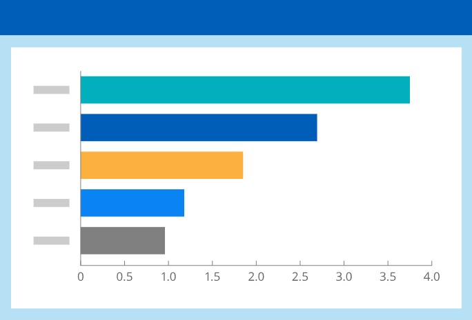
Bar chart
Bar charts are versatile and widely used tools in data visualization. They are effective for comparing and displaying data in a simple, straightforward, and easily interpretable manner.
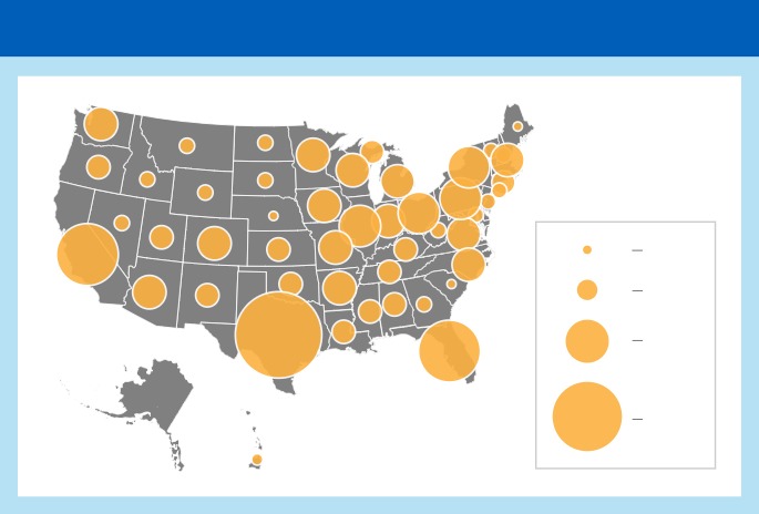
Symbol map
Symbol maps in data analytics provide a spatial context for data, making it easier to uncover insights, identify patterns, and make informed decisions, particularly when dealing with location-based or geospatial data.
Heat map
Heatmaps are versatile tools in data analytics, used to reveal patterns, relationships, and insights within datasets, making data more accessible and actionable for decision-makers.
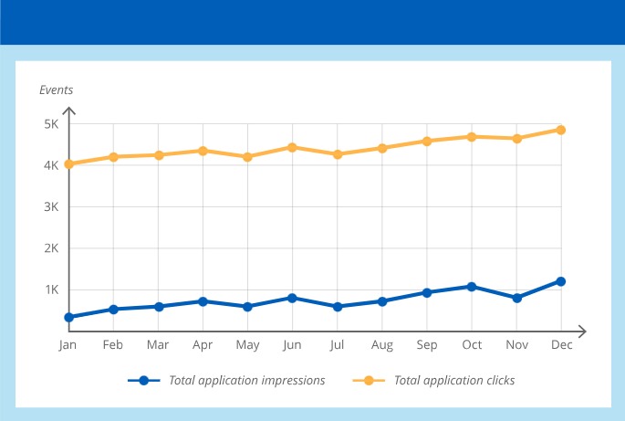
Line chart
Llne charts are versatile tools for data visualization, especially when dealing with time-based data or when you need to convey trends, patterns, and comparisons effectively..
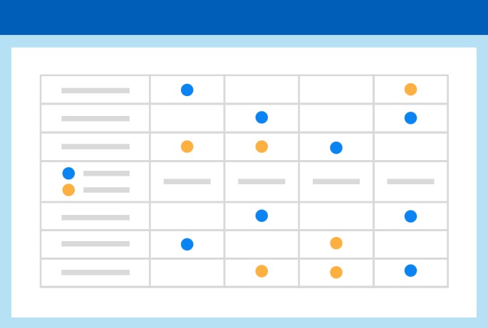
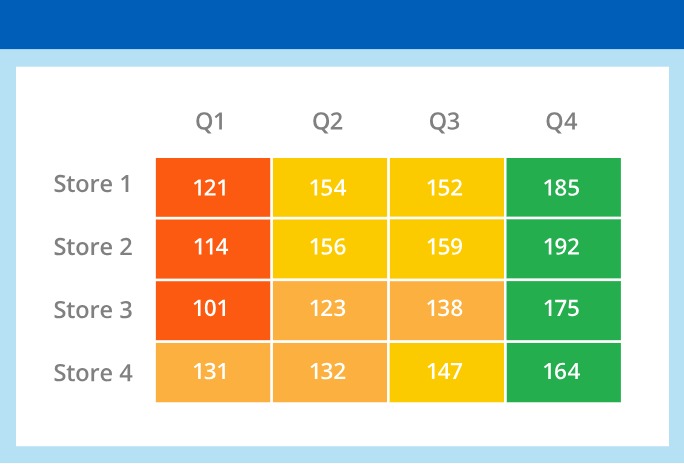
Matrix
Matrices are a versatile tool for data visualization, particularly when dealing with complex data structures and relationships. They help uncover patterns, relationships, and structures within datao.
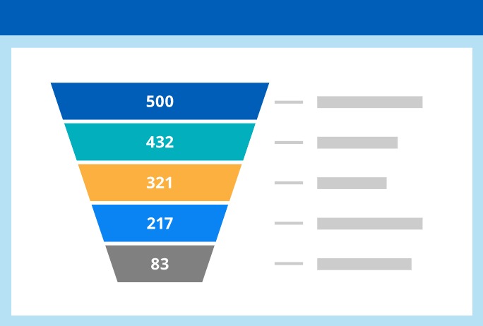
Funnel chart
Funnel charts provide a clear and intuitive way to analyze and improve processes, identify bottlenecks, and enhance the overall efficiency and effectiveness of various workflows and customer journeys.

Tableau
Make powerful, interactive data visualizations and analytical dashboards, across all of your sources, to analyze and act on your data faster.

Domo
Easily view and consume your business data in real time via cloud-based SaaS software on any device.

Power BI
Quickly create strategic dashboards and reports, available on any device, to analyze data and share insights.

Google Data Studio
Transform data into clear, informative reports that are easy to read, easy to share, and fully customizable.
Uncover hidden insights
Want to Make Sense of Your Data?
Turn your data into value and make critical business decisions faster with powerful data analytics and visualization tools.